![[]](./bin/gravy.gif)
Adam Mikos,
publisher |
Two recent drawing shows further prove the Art Institute of Chicago adores Ellsworth Kelly.
His work is nearly always hanging in the permanent collection and his decade long installation in the Rice building was recently replaced with a series of painted aluminum shapes that will be exhibited indefinitely. A commissioned series, I hope they came with a warranty.
Kelly's work is so austere that to not like the work is to feel accused of not liking colors and shapes at all. The guy has a great eye for pure forms in nature, and as you get accustomed to his way of seeing, you begin to find little Ellsworth Kelly-like shapes in everything.
Nonetheless, his paintings all but scream for VIP treatment, as though one can't enjoy a curved swath of blue unless it is writ large and clean and hung in the purest surroundings. Everything is far more sumptuous than is probably necessary (the $45 soft cover catalog for his drawing shows included). Kelly's big shaped canvases are so de-politicized they almost swing back like a punch doll and force you to remember that while you are standing there basking in their beauty, people in other parts of the world are being decapitated with machetes. Perhaps this is why his paintings were commissioned by the Holocaust museum (in order to experience pure beauty, you must momentarily forget absolute horror?).
Kelly's wonderful black and white photos reveal his ability to find beautiful shapes in common crap, but his paintings take you back inside the large stark modern houses, galleries, and museums they were made for (No Shoes, No Shirt, No Shapes?). The far more modest, experimental, and exciting early drawings that hung in two complimentary exhibits revealed that it didn't always have to be this way.
Kelly's objective with the suites of shape paintings is to create a harmonious interaction with the architecture. He intends for the wall to provide a ground for his isolated shapes/figures and sometimes this works. On a recent trip to the Kunstmuseum Winterthur (the current stop of the drawing shows), I saw two 1996 paintings, Blue Curve and Black Curve, that pull it off. Hung together on the same clean white wall, the shapes transformed the space in between each canvas creating a curved volume of white. The top horizontal edge of Blue Curve was almost perfectly aligned with a nearby doorway, capitalizing on another opportunity to use the wall to create new shapes. Winterthur was a dreamy space for Kelly's work; unlike the space in the Rice building which poses several design challenges.
The old installation in the Rice building was fashioned from preexisting works. Each stretched canvas was mounted approximately a half inch from the wall creating a slight space between the wall and the back of the picture. Ugly brackets held some of the corners in place. The pieces seemed to function mainly as decoration and I wondered if the material quality of these paintings held them back from really confronting the architecture. What if the shapes were painted directly on the walls like Mel Bochner or Sol Lewitt?
What if the shapes were cut out of the wall like certain works by Lawrence Weiner or William Anastasi? What if the walls were neatly gouged and the paintings were embedded in the surface - perhaps flush like Charles Ray's spinning white disk? What if he sawed through like Gordon Matta-Clark? What if the canvas alone was attached directly to the wall in the manner of Richard Serra's massive oil stick on canvas architectural wall works? What if the shapes were larger, so their pointed tops or bottoms grazed the moldings - deliberately pulling your eye to the edges of the wall rather than isolating themselves in the middle? The idea that the works might be much smaller, following the example of Richard Tuttle, never seems to have been considered; Ellsworth Kelly doesn't make small paintings. To be fair, the corridors of the Rice courtyard are a tough place to hang paintings.
The distance from the wall to the railing is only about eight feet, the museum puts wire stanchions in front of the work, the walls are broken up by doorways and complicated molding, and the railing overlooks a sculpture court that competes for your attention. One can view individual works from across the space, but the view of all three works on each side is disrupted by pillars. These pillars break up Kelly's shapes, giving the viewer the power to edit his solid forms, making a successful play between the paintings and the architecture. In the new series, Kelly has chosen to extend the paintings off the wall by three inches which reinforces their object nature and creates a pronounced shadow.
Your eye does not go to the play between the shape and the wall, but instead shoots directly to the projecting edge of the painting and across the painted surface. The metal boxes that float the painted shapes away from the wall are a highly noticeable and clumsy solution.
Individually, the works' quality varies. All share Kelly's timeless but unexciting sense of color. The green painting is the largest and most forceful - the closest to really having it out with the architecture. The curved yellow painting is the most elegant. The awkward red painting appears to be accidentally warped. The scale of these shapes, which reminds one Art Institute employee of backboards, is overly comfortable - neither too small to come as a surprise, nor too large to really challenge the walls. Kelly's success is his ability to balance these differently shaped and colored works as a group. Ultimately Kelly takes no interesting chances with the Art Institute's architecture or his conception of painting itself.
His modest older drawings prove far more experimental than these duds. Where is that sense of play and excitement in this sterile, corporate-looking installation? Kelly is a master of shape and in numerous older paintings and drawings he proves his mastery over figure/ground relationships as well. He has given us neatly balanced wall filler for the Rice building, but he has not given us a satisfying experience of art.
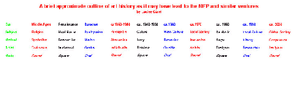
Throughout Modernist Art, there have been instances of painters who produced sculpture and sculptors who painted. Examples include Louise Bourgeois' objects and her 'insomnia' drawings. Constantin Brancusi, is as much a revered draughtsman as sculptor of ideal form. The painters, Pablo Picasso and Joan Miro translated their visions in bronze. Evolutions of sculpture and two dimensional forms have resulted in dramatic crossovers: Polly Apfelbaum's velvet fabric constellations for the floor, Jessica Tuttle's drawing-objects. Consider too, Joseph Cornell's 'boxes' as sculpture occupying the window of conventional painted illusion. And then, there is the example of Ellsworth Kelly.
A gifted artist, Ellsworth Kelly has been painter, sculptor, print maker, draughtsman, and photographer. Challenged by site-specific commissions and unique viewing conditions, he has ten first and foremost about the nature of his painted works. An entirely different approach would be suggested with more dispersed and obtrusive three-dimensional placements.
In September of 1999 Kelly introduced a variation to his initial Courtyard Installation (1989-99) at the Art Institute of Chicago. He exchanged 6 paintings on canvas for 6 painted aluminum panels. As individual works, the new pieces are satisfying. They are consistent with other wall-mounted examples. Yet, the new Courtyard Installation, in attempting to integrate painting with a permanent site, leaves me questioning both the capacity of the Institute's physical structure to include 'installation art' and the inherent nature of Kelly's art.
For an assembly of pre-existing paintings, the first Installation was impressive. Kelly's colors flaunted their primacy. The canvasses were fragile and monumental at the same time. Strong shapes of the white, orange, and green panels suggested fragments seen through/edited by apertures such as windows, doors, and columns. They were tenuous: equivalent to a color-slide partly jammed in a projector or a photograph loose from a hinge, dangling out of its horizontal register. One remained unsure of what was being seen. It is precisely the assembled paintings reduced vocabulary that made their scale and presence so charming. If indeed Kelly meant to interact with the architecture, he did so casually and confidently. Yet, ne. Components were brought together from existing series and hung on walls flanked by door openings.
The spaces seemed adversarial to other paintings. Kelly's grouping would inspire conflicting responses. They were 'eye candy' for the converted or 'classically flippant' examples modern-type art seen by crowds on the way to numerous blockbusters: the Monet, Caillebotte, Cassatt or Redon Retrospectives. As the former, they possessed little room for one to back off and assess (they were better seen at a distance across the open court). As the latter, they were poised anonymously along with the beaux-arts or - a part of an architectural, museum experience. To the impressionists-only mobs, they were hardly more than a photo backdrop. A few pieces were replaced in the first three years due to their 'on loan' status. They were the subjects of off-the-wall sales. An ideal initial grouping was compromised from the start.
Kelly's 1999 replacements came as a surprise. Customized and endemic to Chicago and other cities. Grandiose and far from anything but a trophy-spirit, such public art is over-determined to persist (survive all climates) and remain detached (to sit in plazas or lobbies, indifferent to context). In contrast, Kelly had a coveted sensibility that retained connections, suggested parallel perceptions and existed as postulate, not divine proof.
Painting as a rarefied, antique practice is a vulnerable one. Whether in tempera, encaustic or oil pigment, most paintings when completed are high maintenance artifacts, sensitive to temperature, humidity and exposure to ultraviolet rays. Sculptures and architectural structures have fared better from antiquity compared to pigmented surfaces. It doesn't seem to matter to later Western eyes that much classical Egyptian, Greek and Roman Art was initially polychrome. Three-dimensional sources are often the signifiers of formal evolution, by default. Thus, painters who courting immortality conceive of less fragile, more sculptural work or are at least drawn to it.
This is not to say that Ellsworth Kelly's work has been solely a nod to permanence. Kelly's resolved, discreet forms are some of the most vulnerable examples of contemporary art, comparable to the works of Ad Reinhardt, Agnes Martin or Robert Ryman. Conservation repainting and restrictive hanging conditions have been common to Kelly's output. Even though his monochrome paintings are rumored to involve seven paint applications, Kelly's hand retains a housepainter's neutrality. An allegiance to such work for an extended career would compel an artist to consideration more permanent and commercial forms.
Kelly is no stranger to fabrication and assistance. By employing firms such as Lippincot of North Haven Connecticut to produce many of his free-standing pieces, and collaborating with master printers at Gemini G.E.L. and Tyler Graphics to produce his editions, Kelly has involved other hands than his own to generate his work. These painted aluminum panels have been fabricated for the Art Institute. Manufactured on the West Coast, they were conceived on the East Coast to be exhibited in the Midwest. Shaped supports and bold placement of color, ingredients that Kelly has examined well, are present in the current grouping. The artist's characteristic playfulness and a human quality are not.
The 1999 pieces are smaller, more ornamental, with less inviting surfaces. The panels 'talk to one another' less. Braced four inches from the wall, they are 'cooler' and read as fixtures. This installation of physically stubborn pieces provides a semi-permanent disappointment. Analogous to over-cooked produce these works are characterized more by what is lost than what remains. Having submitted to the architecture like theatrical film submits to video format, they have lost an aspect of their purpose.
"I draw in order to see what surrounds me, but also to see that which excludes me" comments Haluk Akakçe in his essay from the biennial catalog. What about those things that include him, or do they not merit inclusion by Akakçe and the 58 other artists chosen by Paolo Colombo for this exhibition?
Fortunately, what did exclude these artists was the recent disaster that befell Turkey just weeks before the opening. Many unavoidably pegged this event the earthquake biennial. Impossible to ignore, it is salient to examine the work chosen and wonder if premonitions haunted each artist who participated. Simplicity and immediacy seem the conduits here, a lack of overindulgence. Not to be mistaken for the quick draw or the mundane, Colombo has chosen work that is scrupulous, deliberate, and sometimes even visionary.
What surrounds the Dolmabahçe Cultural Centre, Yerebatan Cistern, Hagia Eireni Museum, and the billboards, which housed work for this biennial was prudence. Wandering through the neighborhoods of Istanbul, from Sultanahmet to Taksim, the chosen exhibition locations and tremor-ridden streets that pulsed in-between, introduce themselves conspicuously for their lack of excess; an accepted conceptual norm in the United States. The streets, stores, and homes here are frank, where necessity is met with ease, no time wasted on transitory trips to Starbucks", or in the paper products isle of the grocery store, choosing the right pattern, texture, weight, fragrance, size, and color of this weeks paper towel.
William Kentridge evokes and then abolishes glut while gracing the condensation of the cistern's textured walls with Shadow Processions. This 35mm animated film, with specific political and personal intentions, cleverly seduces before capturing the viewer. What you innocently perceive as a beautiful parade instantly stabs your heart with its slow, unforgettable march of pain. Pain of things lost and still remembered. The specific site of this film magnifies its long collective truth, leaving no chance of quick getaway. The marriage of image and emotion is inescapable, proving itself in a kinship that we, the viewer, may or may not want to acknowledge.
Kentridge's work is interestingly juxtaposed by the work of Kara Walker. Black history, slavery and apartheid, South Africa and the ante-bellum South, retold from a black, and a white perspective resulting in innumerable shades of gray. At first glance even their techniques resemble each other, differences clearly stated through Walker's biting commentary, whereas Kentridge recites ocular poetry, every change in tone, pitch, and speed considered.
Arturo Herrera speaks of his own work as " simple and striking...in an intimate private domain". His work gives us, as well as the artist himself, an experience that upon initial encounter seduces us with color and form, a visual pleasure that exceeds our expectations. Herrera speaks of the importance of epiphanies, which intuitively identify his work without the need for constant resolution. Beauty found in mere existence, without explanation, only a continual flow of attention grabbing questions.
Other artists, like Tony Oursler, address excess head on, or should I say eye to eye. Like encountering a patient in an Oliver Sachs book, or adopting their rare condition, Oursler's investigations seem to question conventions not only of the twentieth century. The dome of the Hagia Eireni here too seems important, a longer history than we are used to associating with Oursler's work. Notwithstanding, the artist seems to be asking us what is worse, being inundated with the unremitting signs and symbols of the approaching millennium or the icons and mythologies of the past. What seems more injurious, the constant stimulus encountered at every conscious and unconscious state or the hypocritical homily you sat through the last time you went to mass?
Haluk Akakçe, uses his visionary drawings as a critical tool of communication through linguistic and non-linguistic systems. Schooled with an MFA from the School of the Art Institute of Chicago and currently working as an architect in New York, the work provocatively incorporates the exactness of an architects hand with the fluidity and understanding of a seasoned visual artist. His paradisiacal themes, present throughout his work, move past appetizer-sized suggestions at this biennial, enticing the viewer to a main course of unattainable worlds remindful of a 20th century Hieronymous Bosch. In Love Promise, his combination of text, numbers, and images result in an unexpected almost voyeuristic journey, additive yet somewhat uncomfortable, leaving the viewer questioning where the narrative ends and unadulterated fantasy begins.
Ebru Çzseçen's, Sugar Chandelier speaks less of excess, and more of patience. Çzseçen, a Turkish born artist, returns to her native country to examine women's issues specific to Turkey, with a delicacy and beauty illumined by warm Mediterranean light, an unusual approach to feminism. The subtlety of her delivery adds to the viewers reverence of the piece. Pondering the ease with which you could alter or destroy the sugar shapes, one becomes quickly aware of their lasting quality, their strength.
Priorities shift quickly upon returning from the Middle East, as excess once again becomes the norm. Ripped from underfoot is the essence of what had become inclusive, exclusive, and illusive. Fragments of visionary moments still subsist, like a tourist grasping for perfunctory souvenirs. Akakçe, who comments on having similar nomadic relationships to his drawings, understands that these are jewels one can only hope to take home. Their momentary existence alone is prodigious; a paradise dangerous to willfully consider.
"The Millennium Fusion Project" or "How I Spent my Xmas Break"
The Millennium Fusion Project was a holiday festival replete with mustached saints, banners, decorations, colored lights, holiday cocktails, music, singing, camcorders, treasure hunts, toys, costumes, and gifts. It was the coming together of generations, friends, relations, children, coworkers, in-laws and out-of-towners. It was Christmas, Hanukkah, Kwanza, Festivus, Mardi Gras, Burning Man, Kasmir Polaski, New Year's Eve, and Oktoberfest. It was one hell of an office party. It made us be spontaneous, take chances, make believe, express our unique individuality, hang out, and have fun. When it was over, we were left with impressions, memories, snapshots, and something to talk about. For a brief moment, art became life.
--Mark E. Genrich
"The purpose of art is washing the dust of daily life off our souls." Picasso. I like what he said.
-- Shuko Wada
What's to say, it looked better the more stuff was crammed in the room. Aesthetics were a sidepoint. Some people did some real crap, some did good, but it all came together in a PeeWee's Playhouse kind of way. What was funny was the number of people who did what they would have anyway and did not attempt to set a stage for the other works. In general mischievous works came off the I would like to do it again. Next year we should have the Real Millennium Fusion Project.
-- Anthony Elms
The space should be bigger, and we should go for more generations. It would not take long before the entire city was a part of the madness.
-- Art Myer
Where is everybody and whose feet are those?
Breezing through Chicago with only one day to set up, I went to ARC on Monday to activate my tent apparatus. I meet Shuko in a subway stop to exchange keys to the gallery since this was the day that the space was closed. My desire to bounce ideas off of several others didn't really happen since I was the only one there. I guess it was the wrong day. The possibility of lopping off anything that looked like a head from the previous versions of the exhibition and piling them together will go unheard (but not unread). Where is Kmart? I wanted to line my blue shelter with foam bedding. A man in the building offers to take me after a conversation in the hallway. People in Chicago sure are generous. I come back with the material but the idea falls flat. After a few hours of inserting sticks together, cutting, and gumming the edges down, Shuko enters. After some recommendations of art to see on tomorrow, the last day of my stay in Chicago, I say goodbye.
Before I exit, I go to the bathroom, but don't quite enter. I feel a presence and look under the stall to see a pair of nasty bare feet. Hmmmmm. . . . Isn't the gallery closed? Aren't we the only people on this floor? I returned to the gallery to confirm these assumptions and Shuko agrees and we surmise that it could be a homeless man who may be living in the building. She asks me to ask. Wandering back to the bathroom, I imagine all the worst case scenarios and even energize myself with a possible confrontation with ? The man exits the bathroom before I enter and I ask him who he is . . . as if I am not a stranger here. He is just the musician who rents the loft next to the gallery and asks me to come to their open house that night for beers if I want to . . . OK
The next day . . . I stop by with my disposable camera to take a picture. Hey, I get to meet another of the 27 artist in my generation of the project. Darlene has placed rubber disks with photos at their center in the middle of the tent. Thanks. She seems to have completed the thought that didn't quite work in my experiment with foam bedding. Is this what is meant by fusion? SO I missed the party.
-- Darrin Martin
I actually had difficulty describing the exhibition to friends, or finding good reasons for them to come to the openings.
I was a strange experience; the whole look of that tiny room like a third-grade classroom gone beserk (as someone else noted). Going up in artist activities by powers of three was certainly explosive. The fourth opening would have been... mmm .. 81 additional artists.
It took the gallery experience to a new dimension, becoming a dialogue between artists, to the exclusion of the viewing public. Sort of like, "This is what I do; see if it fits in," and, "here are the traces of what i am all about."
I found the continuous interplay of trust and transgression interesting, and how each of us drew limits. Nobody got seriously pissed at some later work, and no-one seemed to have threaded heavily on exposed toes. The "fusion," when it happened, was the most interesting aspect. I especially liked the Joel Score footprints which appeared the next day after Shuko placed her white papers. It is the sort of activity which you instantly recognize as correct and radical. You don't even have to think about it to recognize it. It should have been followed the next day by handprints on the wall.
-- Jno Cook
Here we go: For a first time participant in a project of this nature, I have a few observations: I expected a little more advanced collaboration among the artists -- not to ate, how to deal with the previous generations' work (I was in the third one) creatively but decisively. So, that was a disappointment. On the other hand, in spite of the lack of communication, everything actually looked right together and the art pieces seemed to complement each other. So, go explain?! (Who says communication is important?) Maybe after seeing the first stage, and then the second, we registered enough to be on the same wave lengths. Since this seems to be spiraling into a web (thanks Jno) of spirituality, I'll just close with a final comment -- I loved seeing children using the tent and becoming participants in the happening. I think they got into the playful nature of the pieces.
-- Leah Broyde Abrahams
(expert on hauling a ten foot traffic
light from Green Bay WI to the ARC, but not on getting it back......
In a city where the art scene seems sometimes lifeless and definitely small and incestuous, the millennium fusion project provided transcendence from these pre-engrained judgments. Even though some of the players remained the same, there was enough otherness to generate what seemed a new kind of interest; a selflessness not usually seen in the artworld. Dogma, although present, did not run or ruin, only enhance the interaction that I thought nonexistent in this world. Refreshing, and maybe even inspiring; cheers to the success of the whole, instead of its' individual parts.
-- Darlene Kryza
attention: long, pointless, blow-by-blow rant ensues, similar to what would happen if they released a re-make of "the breakfast club".....
*sigh*
Well, I can only speak for myself as a Fantasia/Vintage Disney Purist. I thought the film as a whole was terribly weak; and it was like, half as long as the original, and so had less rope to hang itself with.
The whole thing was littered with celebrity intros, which were gratuitous yet entertaining. Penn and Teller, in particular, were great. Angela Lansbury's just old. Remember that she is 75! I challenge you to find me a better looking 75-year-old, especially now that Jessica Tandy's dead.
The first piece they did, Beethoven's fifth fer cryin' out loud, SUCKED. I was downright offended. It was completely abstract, in the same style as the abstract first piece in the original, except BAD. It was just ugly. It was all triangles and swooshes and little bits, all in garish 80's-colors. Then the triangles turned into pseudo-butterflies, which got attacked by evil (musta been, as they were DARK) locust/bat triangles. Amateurish, uninspired, and ugly; a goddamn shame, considering what a powerful piece the fifth is. Certainly not without flaws, but big nonetheless, leaving no excuse for mediocrity.
Anyway, then there was this bizarre flying-whale-epic to Respighi's pines of Rome - Otto had the right idea with trees, IMHO. It was nice, but a bit too trippy yet heavy-handed for me, not to mention some biological inconsistencies contrasted with realistic details. but I'll let it go. It meant well, and was rather pretty.
Rhapsody in blue; cute, interesting style. Not All That (tm), needed a bit more elbow grease, but still relatively original in a neat, un-Disney style. Patterned after Hirschfeld, which was cool, although I woulda liked it if they'd stuck more closely to his caricature style, but pretty good.
Lessee, I think then came the BEST bit, by far. the finale of the carnival of the animals. FUCKIN' INCREDIBLE. SO funny, I thought I'd pee. I can't think of a better example of something that makes kids AND adults laugh, for the same reason and equally as hard. JUST GREAT. A flamingo with a yo-yo. Classic. I laughed, I cried, it was beautiful. AND THE BITCH WAS, LIKE, LESS THAN TWO MINUTES LONG!!!!! The best piece, and the shortest. That whale shit went on and on and on, but the yo-yo flamingo was over in a heartbeat!!
*gesture angrily*
I think at that point they may have stuck the sorcerer's apprentice in. They didn't even have the decency to brush her up at all. It was grainy, but still had all the charm that most of this show lacked so painfully.
OH, Jesus, then there was the Noah's ark bit starring Donald motherfucking Duck. To POMP AND CIRCUMSTANCE, despite that set-up, it was cute. Should have been _way_ cuter, considering, but when was the last time Donald Duck was in something? Nobody's left at Disney who remembers how funny the Archie Bunker Duck was; now he's just a _white_ duck with a speech impediment. Cute touches, though; like how two bunnies got on the ark, and about 15 got off. Weak, though.
There was "the steadfast tin soldier", a piece to a rather ponderous bit of Shostakovich. They're apparently VERY proud of this one; I thought it was crappy. Yes, yes, kinda sweet, yadda yadda; but the animation was weak, the story was weak (and it's Hans Christian Andersen, it's not the writer's fault, yaknowwhatimean?), and it went on too long, too. Got on my nerves. Reminded me of a sort of "Toy Story", but done with polish mimes.
HOWEVER, the finale, the firebird, was EXQUISITE. so, so, so, SO beautiful. Just gorgeous. It filled out the music, had depth, was entertaining and pretty, yet suspenseful (I think they meant it as a kinder, gentler night on bald mountain). I was very, very happy with what they did. Stravinsky would be proud; especially as I've seen far worse done to it in ballet. I *heart* this segment. I don't think I could compare it to the yo-yo flamingo, though; very apples and oranges. But I loved them both SO much.
To make a short story long, Walt must be turning over in his grave. I think Disney has become a weak caricature of itself in the last five years, and I saw nothing that was even up to its current level (even the two I loved, still, could have, should have been better). They just didn't seem like they were trying. The whole thing carried off like, "well, stick some big stars in there, swoosh a lotta bright colors around! Adults will love it because they remember the old one, and kids don't know any better!" It was just so WEAK. There was so much more that _should_ have been done, and even more that COULD. It was half-assed and half-hearted. Despite all that, it was still _okay_ cumulatively. A couple of wonderful bits, too many mediocre ones, and one that someone should be SHOT for producing.
*exhale*
My very personal crack house is currently located on Point Street. This is the no fly zone between California and Western and between North and Milwaukee. It's a big, what, trapezoid shape? This is the area that people keep trying to call, West Bucktown, but which I and the other people I know who live in this trapezoid call, Hell.
Point street is a street that only exists for two blocks in the entire city, or maybe doesn't exist at all since it seems to be the Bermuda trapezoid of crime. All crime that passes through gets stuck in it's tidal undertow and just kind of washes over the area all day and night.
I'd thought I had actually seen it all until I lived here. Now I have not only seen it, but lived it, with these morons. But here's the catch 22... I can't move out of here. We got stuck just like everyone else on these two blocks. The exact reason is that our apartment is a palace on the inside; I never lived in such a nice place ever -- but only on the inside; with paper up in the windows.
My sister and I are the only white girls who are not crack-ho's; so I had to deal with a lot of johns and pimps right when we moved in, and still do.
Then I had to get a gun. After a crack-ho fell into the house and saw all our stuff one day. She was leaning up against the door when I went to open it -- something I normally don't do without looking outside first, a very bad day, that day.
Next a found a dead guy next to the house and had to call the police to come take him away; just some bum, no big murder or anything.
And then there was the day when I opened my back door and I had a length of chain in my hand because I was going to chain my grill to the porch. (details important to the story: I was wearing a skirt, tank top, and red sandals), and I see a guy breaking into my neighbor's car at High-Fucking-Noon! So I jump off the porch and run up to him brandishing my chain and start screaming that he has to, "put everything right back in the fucking car exactly where he found it before I kill him with my chain," which I am waving in the air. Then I thought, maybe I got myself in a little too deep in the neighborhood.
There are things I ignore, like the people whose names I know, who smoke crack on my porch, and the one pimp, Freddie, who beats up his girls in my backyard. I usually check to see if he is beating them up against my car and if he is, then I'll yell something like, "Hey, I'm trying to live here," and they actually will move to a different spot.
Crack House Quarterly is free to subscribe to, and I currently am the only one working on it. Everyone else has overdosed or been shot. Well, one guy is on sabbatical and working for the archdiocese...
-- CHQ Editor, B
by Mike Kaysen
Show runs until April 9.
I recently went to a lecture at the Art Institute regarding the Thomas Hirschhorn "Installation". Being troubled by the work since seeing his installation in "Unfinished History" at the MCA, I was interested in what would be said.
At first blush, these works almost demand to be dismissed. They are produced from the cheapest of materials: tinfoil, saran wrap, news paper, photocopies, markers, ball point pen, construction grade lumber, spray paint, plastic tape and such. I did not want to like this work but I needed to be sure that this was not a knee-jerk reaction to the inherent value, (or lack thereof) of the materials. There is a minimal amount of craftsmanship involved in the execution of these installations and, as I am a craftsman by nature, tended to rub me the wrong way.
After spending some time with the work, I determined that cheap material and poor craftsmanship was not the source of my irritation. After all, there is a long history in 20th century art of artists using the detritus or debris of society to create their works. As a matter of fact, I am a big fan of much of this work; beginning with Kurt Schwitters and his "Merz" works, continuing on right through the 20th century. Also Picassos' assemblages, Jean Dubuffets call for an "Anti Art", Robert Rauschenburg's and Jasper Johns' constructions, as well as some of Andy Warhols work. There are any number of artists one could name (lets not forget Claus Oldenburg) whose work was made with "valueless" material.
No, what bugs me about this work is an unshakable "tossed off" feeling that it produces. Mr. Hirschhorn spills his guts to us in a gallery and we are supposed to care? How can I be expected to care about something that the artist doesn't care enough about to think through before he presents it to the audience? What is he telling us about: vivisection, the fur industry, mass production/consumption, consumerism, globalism, idiot politicos, war, starvation, proliferation of gun violence, vacuous nature of modern society? Not that this stuff is in any way irrelevant, but his laissez-faire attitude tends to diminish the seriousness of the issues. Most of these issues have been discussed in recent cover stories for Time magazine. Several subjects are almost Pop culture in nature (read, "popular"). They are issues contemplated by many people from all walks of life covering a wide range of thoughts, concerns, opinions, and fears. The edge of these issues is blunted by overkill. How can it be a good thing that "starvation" becomes irrelevant solely because we hear about it all the time? Do the curators and gallery directors really believe that just because an "artist" talks about something, the words are profound? Can Mr. Hirschhorn enlighten us solely because of his status as an "artist"? He may bring these issues to the fore, but he runs the risk of being just another voice because the work fails to bring anything new to the surface about issues we all confront on a daily basis.
Additionally, the artist is not completely successful at transforming the space and so the work appears somewhat strewn about, almost as if the room is a three dimensional sketchbook. He has said that this is the way his work takes form; that the rooms should feel as if the viewer is actually walking around inside of the artists head. This approach would account for the "tossed off" feeling of the spaces and installations, but, in my view, this approach does not absolve the artists apparent inability to "control" the space. If you are going to do installations, you must show the viewer that, at the very least, you have CONSIDERED the space and how you are transforming it. Mr. Hirschhorn dismisses this as an issue by claiming that he dislikes the terms "Installation" and "Sculpture" in reference to his work. Get off of your high horse and admit to yourself that you are dealing with the issues that this type of work generates. Is the artist concerned that confronting issues about installation and sculpture would take away from the "sketchbook" nature of the works? Can we allow a "major" contemporary artist to so blatantly shy away from the obvious challenge of his own work?
There are a few positive aspects to this work, though. First of all, in a time when much contemporary art is comprised of video tape and tens of thousands of dollars of video and audio equipment, Mr. Hirschhorn uses materials that can be had by anyone of almost any means at a Home Depot. He also succeeds in creating the sense of drowning in imagery, of too much information coming at us far to fast and he does it with the PRINTED word. In this day of technology, video, the internet, this is commendable. He uses reams of photocopies, broken mirrors, tinfoil, and other shiny surfaces to break up the viewers field of vision, to confuse and overwhelm us, almost like a low tech video montage. In fact, I found the few video monitors included in the installation to be somewhat of a distraction.
In the end, I think he is an artist who bears watching. I honestly did not want to like these works in the beginning but after spending some time in the space, came away from the installation intrigued. It struck me that the work seemed somewhat out of place in the pristine galleries of the Art Institute where most of time everything is controlled; lighting, room color, where people walk and how much time they spend looking at a particular work. In this context, the work has a freshness about it that cannot be denied and should not be dismissed
About Face Theater's recent production Four, is a story about a right of passage that I, as a gay man, know too well. Written by Christopher Shinn and directed by Eric Rosen -- it is a story about four characters, which takes place on the Fourth of July in Connecticut: a white teenaged boy (June), a black university professor he meets in cyberspace (Joe), the professor's daughter (Abigayle), and a ghetto white boy (Dexter) who thinks he's Latino (although About Face Theater's presskit says that this character is supposed to actually be Latino).
As I began to process what transpired on stage, I began feeling rather angry. My reactions first address the play as a written work. Something which was rather unnerving was the fact that June's introduction into the world of intercourse and to the touch of another man was based on a meeting via cyberspace. The reasons I felt rather uncomfortable with June and Joe's relationship is because I know many gay men whose first experience with a another man has been very similar - except the meeting was not brought on and nurtured via the internet, but through phone sex.
And then there was the other relationship, between Dexter and Abigayle, which succeeded, due to the incredible acting done by Armando Riesco, whose portrayal of Dexter was great not only because he was able to emulate a stereotype down to science, but he was also able to add beautiful depth and range. I am specifically referring to a scene which borders on menacing, as he dribbles a basketball maniacally and playfully, the way Boo Radley is perceived in To Kill A Mockingbird, horrific and threatening, "Before the night's over, you're going to tell me a secret! You're going to tell me what's going on in your mind. What -- you think I don't understand? You think I don't have thoughts?" And not more than half-an-hour later he's desperately holding on to Abigayle as if his life depended on it -- sorrowfully crying.
I realized that I viewed Four with three other people, and decided to ask them their thoughts. What did the four of us have to say over all? Everyone of us hated it! Not because it was a horrible evening or a terrible production, but because it stirred emotions in us that as a culture -- particularly as gay men, we would rather not embrace. And the emotion is that of guilt, combined with the loss of innocence -- that makes About Face Theater's production of Four a very uncomfortable evening. Kudos, to Eric Rosen and the rest of About Face Theater.
The concept has bite, the cards for the show have bite (Amerikkka), many of the artists have bite; so why did this show feel and look so powerless? Can revolutionary work be shown in mainstream spaces? We all know the answer to that. Sometimes revolution can be a lonely business.
Show runs through April 14.
To borrow a term for an old teacher, this was a "kerplunk" show. Lots of big stuff, but messily arranged. All the pieces seemed to be invading each others space with so little breathing room between them. I didn't understand any main conceptual/physical connection holding the show together, fueling my sense of disorganization. A few pieces commanded the space they were allotted; Patrick Mcgee had a very strong installation, fully using the height of the space. Jno Cook's sound work can create an atmosphere anywhere he puts them, this time a beat very close to a heart beat coming from a large cube in the middle of the gallery (watch out for the wet caulk!).
I missed Adelheid Mers performance piece, but Arthur said it was very good. Her gelled lights confounded me again, but we shall do battle again I'm sure.
Show runs until April 27, with an "Artists Talk" on April 8th at 2pm.
![]()
